After a year or so of living in the Calgary Trend House we have come to really love a number of the design features that the architect implemented in the house. Below are descriptions of some of the design and structural features we've come to appreciate.
We’ve also been able to secure copies of the original blueprints used in the construction of the house. Click here to view the gallery of blueprint images...
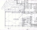
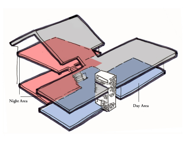
Fig1. Layout
The house is designed in a "T" shape where the top of the T contains the spaces that you would normally occupy during the day - the living room, dining room, kitchen and powder room. This part of the house is at ground level and faces the street in front of the house.
The back part of the T is split into two levels and contains the spaces that you would use at night - the bedrooms, master bath and dressing room, the playroom/office and utility rooms. Because the back part of the T does not have any cathedral ceilings the spaces are more intimate and cozy and the physical separation of the space means that if you are in the bedroom you are not disturbed by any noise in the main part of the house and vice versa.
Although it's not a large physical separation the psychological effect is one of a much bigger house.
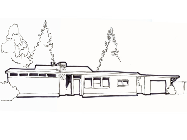
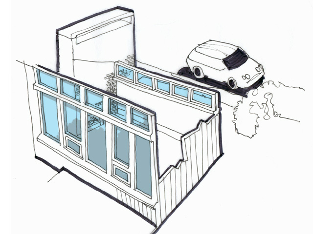
Fig2. Facade
Because of the way that the house is positioned on the site, the front of the house presents itself as a small bungalow that belies it's actual size, which is in keeping with the rest of the houses on the street. The rear of the house where the night areas are are hidden from view from the front in part helped by the gentle slope of the roof of the front part of the house.
As a result the house seems to sit comfortably on the visible part of the property and at the same time makes the surrounding property seem larger as well.
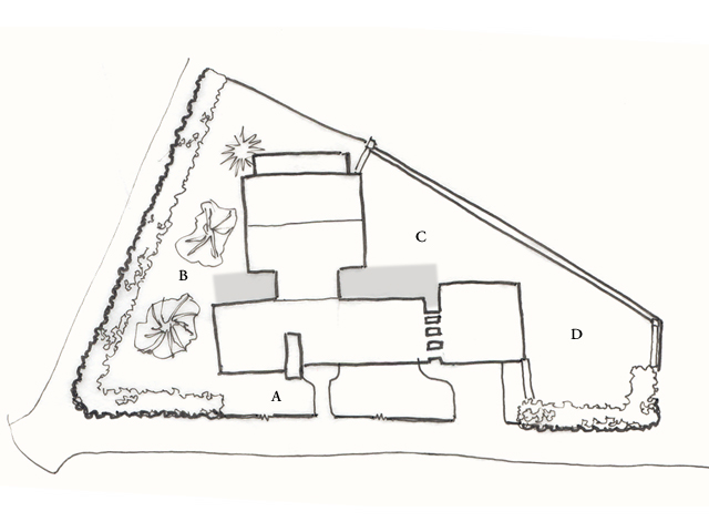
Fig3. Site Plan
The house is sited on a triangular-shaped lot that has a change of grade from the front to the apex of the triangle. The way that the house is situated allows for a number of design features:
1) the lower level at the back of the house is about 50% above grade which allows for full sized windows to be used all around. This makes the lower level incredibly light and airy
2) the house is presented to the street with the least amount of traffic making access much easier, and allowing for the kitchen and window above the sink to face the street, making it much easier to see and interact with neighbours and friends walking by and
3) the house divides the odd shaped lot into 4 distinct outside areas A) the front lawn B) the side yard C) kitchen yard and D) the back yard. Both the kitchen and side yard have patios directly accessible from the kitchen and living room.
Fig4. Window Layout
One of the most noticeable things about the Trend House is the amount of windows it uses. In addition to having a large number of windows (almost 80) it also makes use of the glass to focus the views onto the privacy of the yards.
For example in the living room the large windows face the back yard instead of the street which makes it much less necessary to cover the windows for privacy. The clerestory windows on the side of the house facing the street let the light in during the day and provide a soft light on the facade at night. It also makes it possible to see the beamed, cedar planked ceiling from the outside.
Similarly in the kitchen large windows face onto the back yard while the smaller windows face onto the street. The smaller window over the sink allows you to keep tabs on what's happening in the neighbourhood but the focus of the room is on the view of the windows facing the garden.
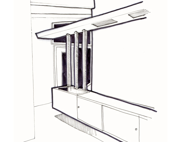
Fig5. Built-ins
A big feature of mid-century modern design is the use of built-in furniture and storage, and the Trend House is no exception. The most visible of these is in the dining room in the form of a sideboard. It has a zinc lined planter built into it and is mirrored overhead by a valence that runs the length of the room and has overhead lighting embedded in it.
Another example is in the dressing room where built in closets and dressing tables have been custom created for the house. Some of the original illustrations of the rooms as dressed by Eaton's shows similar design details in things like the bedside tables and dressers in the bedrooms.
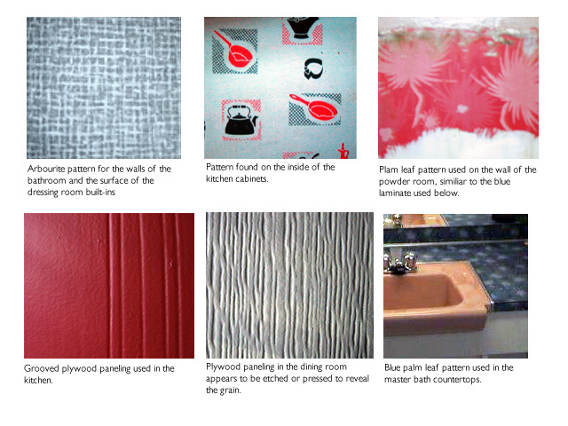
Fig6. Interior finishes
The Trend Houses featured a number of interesting wall finished in wood, plywood and laminate materials. A lot of the walls have been painted over but fortunately the roof and some of the walls in the main floor still have their original finish.
An interesting thing we found when looking at the house more closely was that both of the bathrooms had walls that were finished with laminate, not something you see very often. Metal strips were used to cover the seams, and the overall effect was not dissimilar to an airplane or train bathroom.
One of the most unusual features of the interior is the variety of plywood panels used for the walls and in the kitchen ceiling. In the dining room the plywood has been treated in such a manner that it is pockmarked as if it had been acid etched. In the kitchen, the walls have vertical lines pressed into the plywood at irregular intervals, and the ceiling panels are grooved in a square pattern.